Summer Reading: Week 1
Originally published July 15, 2020
Having found myself with more time on my hands than expected this summer, I have turned to my overflowing bookshelves, to take the opportunity to read and reread books I have accumulated over the years. Stocked with titles covering graphic design, typography, photography, art, and business, some of them I have read in their entirety, some I looked at the for pictures for reference, and some are books I bought with the intention of reading “someday…”
My goal is to read 7–10 books per week for the rest of the summer. Some weeks will be organized by a theme or topic, and some weeks will consist of random selections of whatever I might be interested in at the time. The rule is that I must read every word in the book—even the intros and essays I rarely read in photography books.
The first week’s books were:
Sculpture Now (Moszynska, 2013)
A survey of contemporary practice in three-dimensional art. A good jumping off point for learning who is doing interesting and relevant sculptural work. I’ve been Googling lots of artists for future reference.
What is Exhibition Design? (Lorenc, Skolnick, Berger, 2012)
An overview of design for built environments, with a focus on museum exhibition. A good reference, if bit dated, when compared to the advances in experiential design in the past decade.
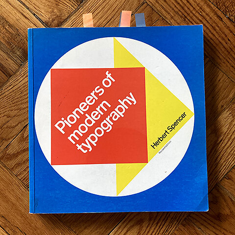
Pioneers of Modern Typography (Spencer, 1968/1990)
Quite literally the first typography book I ever owned, as it was required reading in Leslie Becker’s Type 1 class at @ccagd. Amazing examples of European typographic experiments of the early 20th century. I’ve referred to this book over the years, but I don’t think I ever really read it word-for word. A classic.
365 Habits of Successful Graphic Designers (Saville, Gordon, Berger, Daughter, 2011)
I picked this up off the remainders table at The Strand a few years back, but never really read it. A compendium of professional anecdotes and advice for graphic designers, it is severely dated, and suffers from content bloat. Perhaps it was more relevant when published.
The Architecture of Happiness (De Botton, 2006)
A philosophical exploration of what makes architecture satisfying, De Botton reminds us that, as designers, we are ultimately designing for humans—messy, emotional creatures who don’t respond to the world in the ways we expect. He argues that bad design comes from a lack of empathy, often driven by ego; and that to create successful design and architecture, we must approach the problem without the desire to force our will on our solutions in ways that satisfy only ourselves.
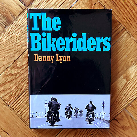
The Bike Riders (Lyons, 1968/2014)
A classic photographic document of an American subculture, I have spent hours looking at the pictures of motorcycle racers and outlaw bikers, but never took the time to read the text, which added a whole new dimension of storytelling in the images. A photo of Outlaws member “Benny” weaving down a dark Chicago street, one hand dangling at his side, bike askew, takes on a whole new meaning after reading the testimonial of his wife discussing his reckless living.
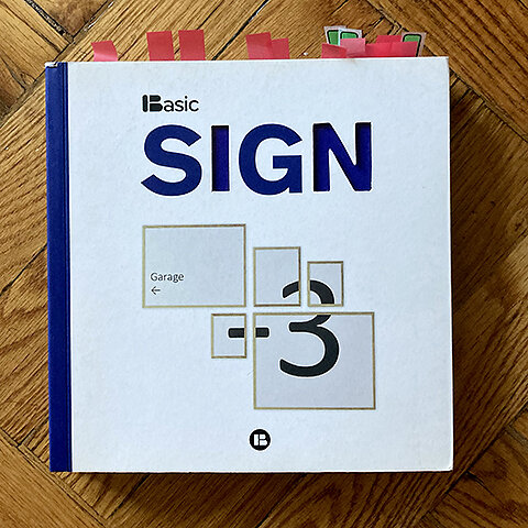
Sign (Basic, 2012)
Published by Barcelona’s Index Books, this is a delightful survey of international environmental and signage design. One thing that struck me is how much more inventive and imaginative environmental design can be in Europe and Asia than in the USA, where we tend to skew more conservatively in our approach to architectural graphics. The one drawback is that the project descriptions (which are oddly repeated) were all written by the submitting design studios, and there is not a consistent voice to the text.
Photographing the Second Gold Rush: Dorthea Lange and the Bay Area at War 1941-1945 (Lange, Wollenberg, 1995)
A photographic study of the Bay Area during the shipbuilding boom of the World War II period by one of America’s masters of the medium. Focusing on Oakland and Richmond, Lange records the rapid population explosion, including a large influx of Black Americans from the South, who came to work in the shipyards. This influx radically changed the make up and culture the Bay Area, especially in the East Bay, where I grew up. The book begins with a series of images documenting the removal and internment of Japanese Americans in 1942, which Lange depicts in all its cruelty and injustice.


