
CASE STUDY:
BREAKTHROUGH PRIZE POSTERS
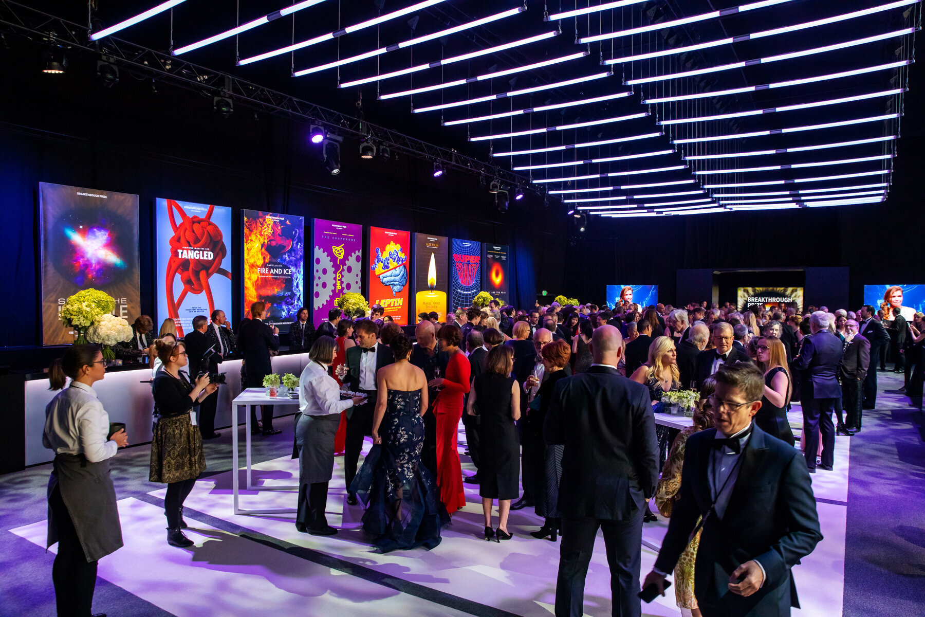
Science meets Hollywood at the 2019 Breakthrough Prize, aka the ‘Oscars of Science.’ The annual award ceremony brought together luminaries of the science and technology worlds with celebrity presenters including Tyra Banks, Ed Norton, and Lavar Burton, musical guest Lenny Kravitz, and host James Corden. Held in a temporary structure built on the grounds of the NASA Ames Research Center in Mountain View, CA, the award ceremony is broadcast live on the Nat Geo and YouTube. I worked with BW Architects to design the environmental graphics for the annual awards show. We designed the entrance to the event structure, interior graphics, a massive step-and-repeat, and posters for the after party and reception.
To honor laureates in fundamental physics, life sciences, and mathematics, we envisioned each of the discoveries as a movie, and designed its poster.
The goal in developing these posters was to create an image that served as a metaphor or allegory for very complex and advanced scientific discoveries such that a lay person could look at the image, and with a single sentence of explanation say “Oh! I see it!” The key to getting to this level of clarity was to frame each discovery as a story, rather than a scientific illustration. This approach was enabled by using the visual language and techniques of film posters, which often take complex plots and characters and distill them to a single image that tells a story in its own right.
The first step was to undertake a deep dive into the history of movie posters to find stylistic and semiotic references. To that end, I visited the Strand, New York’s venerable book emporium, where I purchased several books showcasing movie posters. Collectively, these volumes weighed nearly 15 pounds. I loaded this collection into a sturdy tote bag and schlepped them back and forth between home and the BW Architects studio in Soho throughout the course of the project.
My secret weapon has always been research—I will use even the smallest project as an excuse to buy books to add to my already bursting bookshelves.
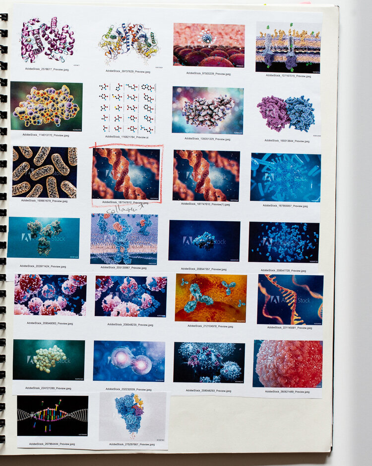
As I worked on these posters—researching, synthesizing, sketching, designing and refining—I kept a sketchbook filled with notes, drawing, comps, and printouts of references. My “project blackbook” was organized by award poster, and acted as the repository for thinking and design process. Below, I have photographed each section to illustrate the process by which each of the posters was developed.
A very special thank you to the team at BW Architects: Basil Walters, Brenda Bello, Ayvind Karlson, Jose Abreu, Justin Weiner, and Abigail Arbel; and the Breakthrough Prize production, broadcast and leadership teams, who run an extremely tight ship, and executed this event flawlessly.
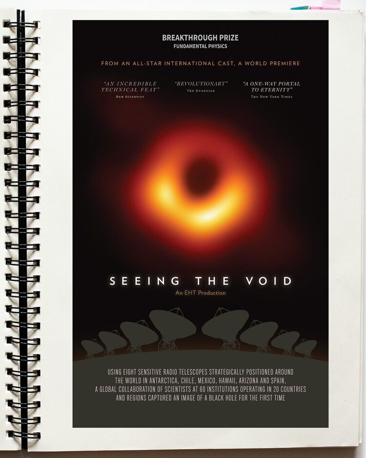


Seeing The Void
The first-ever image of a black hole required the most powerful telescope in scientific history— eight radio telescopes around the globe, synchronized using a network of atomic clocks. A team of 347 scientists working at 60 institutions in 20 countries analyzed a massive amount of data to produce an image of this galactic void silhouetted against hot gasses behind, demonstrating Einstein’s theory of gravity.
To tell the story of this groundbreaking collaboration, I arranged vector drawings of eight radio telescopes along a curved horizon, their dishes trained on the iconic image of the black hole itself.


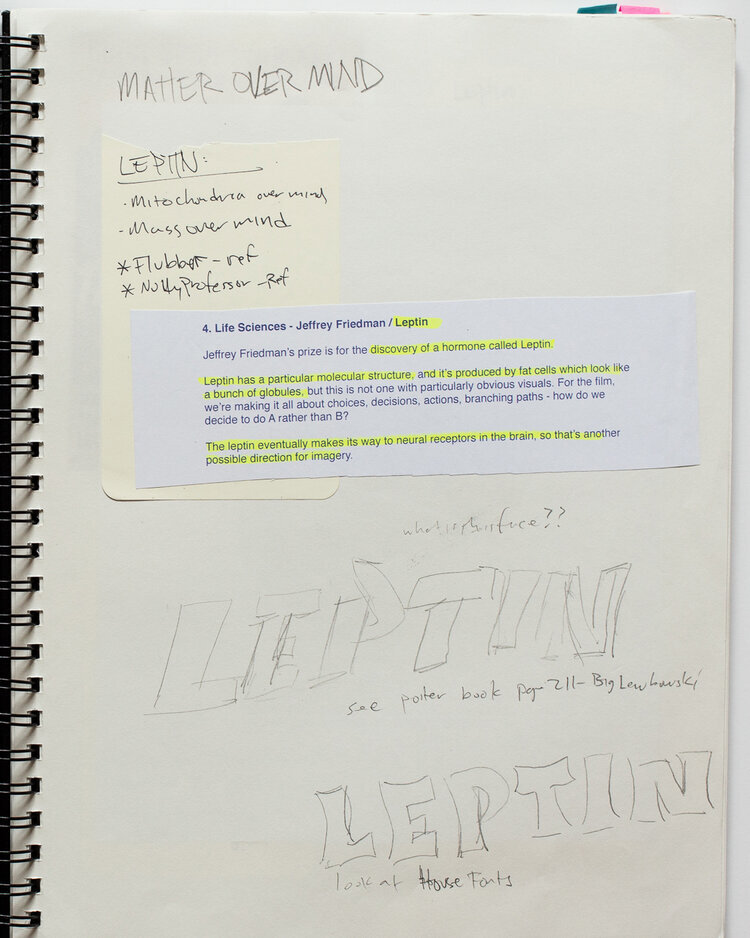

Leptin
Jeffery M. Freidman has been at the forefront of studying the biological basis of obesity. Operating below the level of consciousness and “will power, Leptin is an endocrine system that controls appetite and ability to regulate body fats. This discovery paves the way to understanding and treating obesity not as a biological, rather than behavioral problem. For this poster, I envisioned Leptin as a 50’s B-movie monster, in the vein of “The Blob”, or “The Thing.” The Leptin molecule, as shown in a 3D rendering, had a similar shape to a human brain. By juxtaposing this model of this molecule with a woodcut illustration of a brain, the poster tells a story of the control Leptin has over the body’s physiologic system.

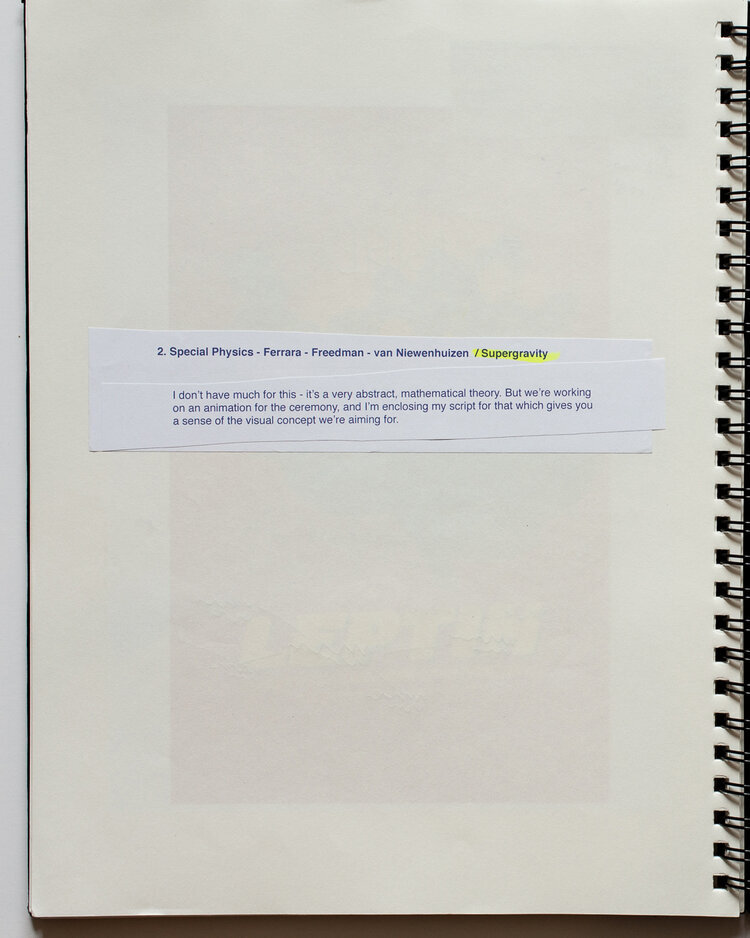


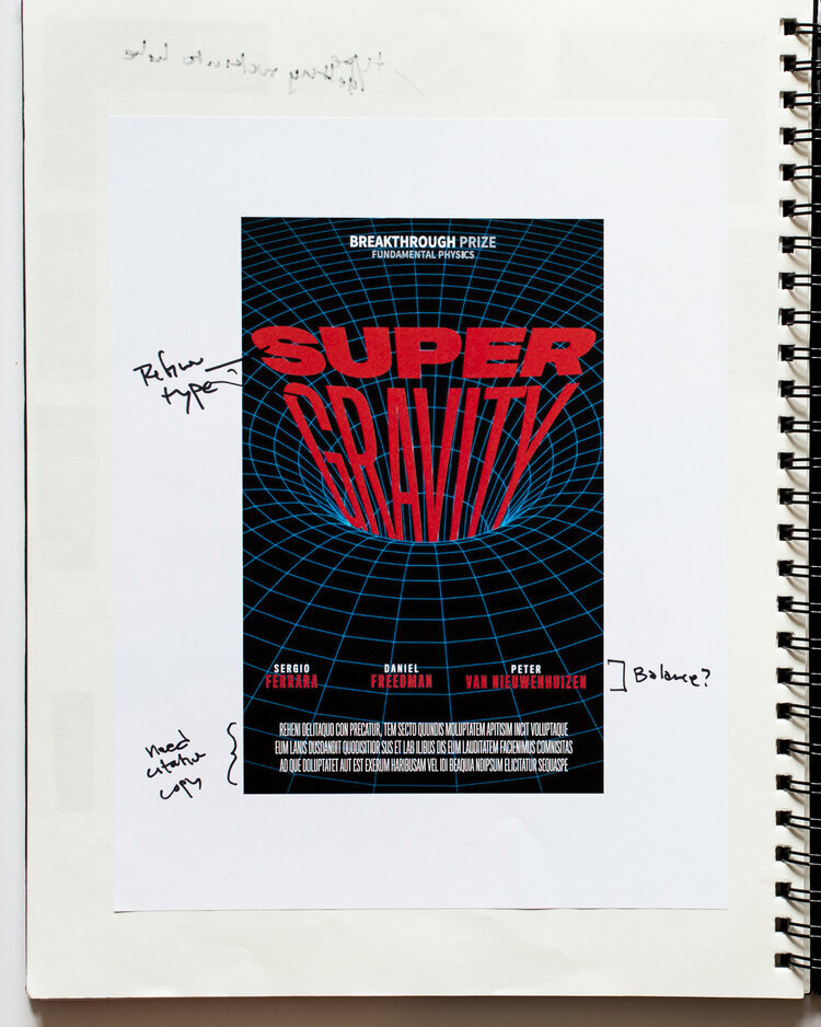
Supergravity
This is the only award that I really could not wrap my brain around. Discovered by Sergio Ferrara, Daniel Z. Freedman and Peter van Nieuwenhuizen, is an extremely abstract and mathematical theory, which provides a link between Einstein’s theory of general relativity, and quantum physics. In researching related movie posters, I discovered the Polish and Czechoslovakian designs for “Solaris,” a 1972 Soviet film based on Stanislaw Lem’s novel of the same name. Both posters relied on diagrammatic representations, which could be read as references to space-time. I leaned into this kind of iconography, finding a stock illustration of a grid being pulled into a trumpet-like shape. Paired with the name set in Titling FB, being pulled into the vortex, we have Supergravity.
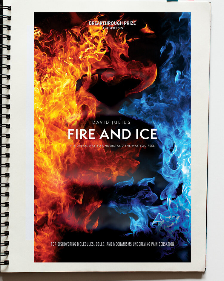


Fire and Ice
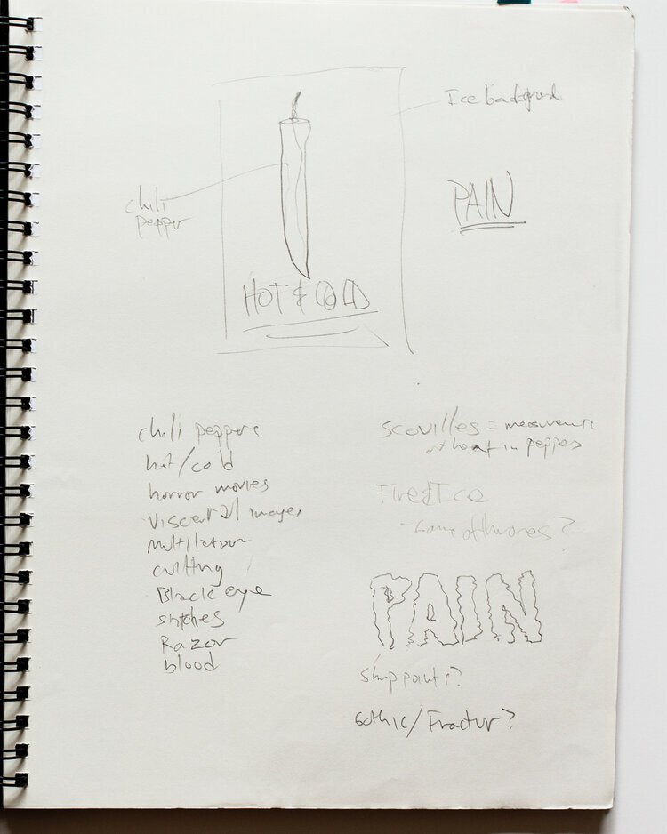
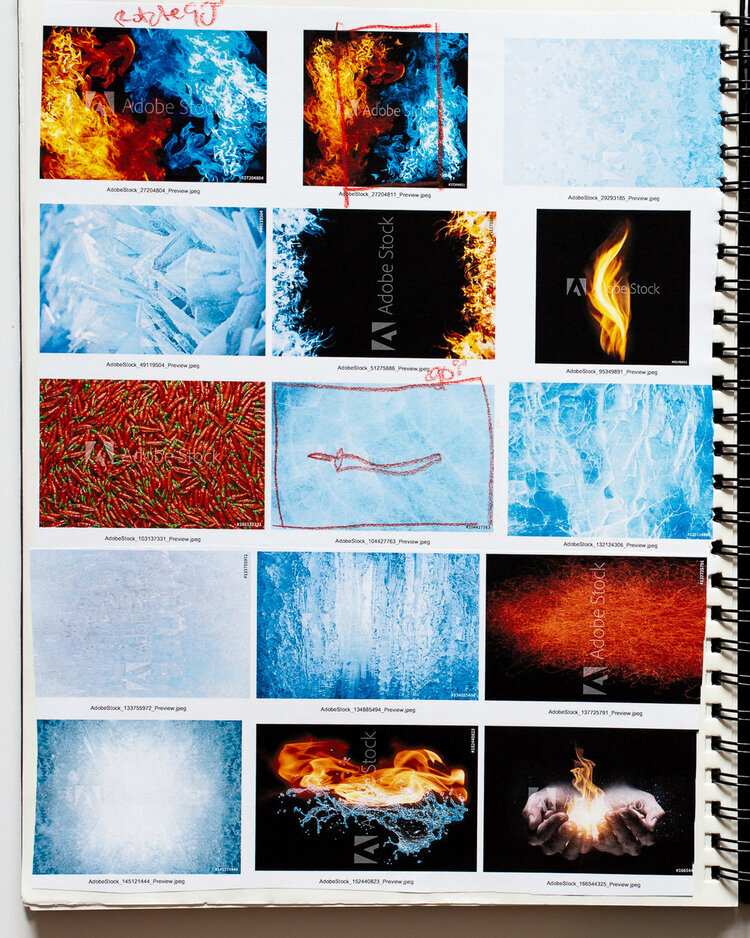
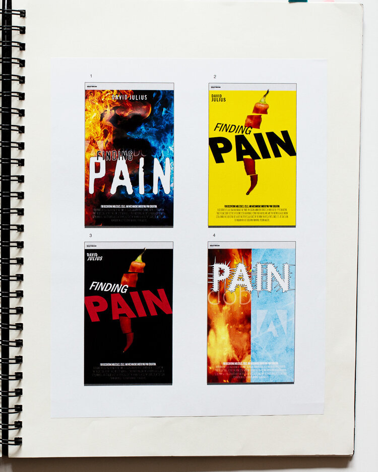
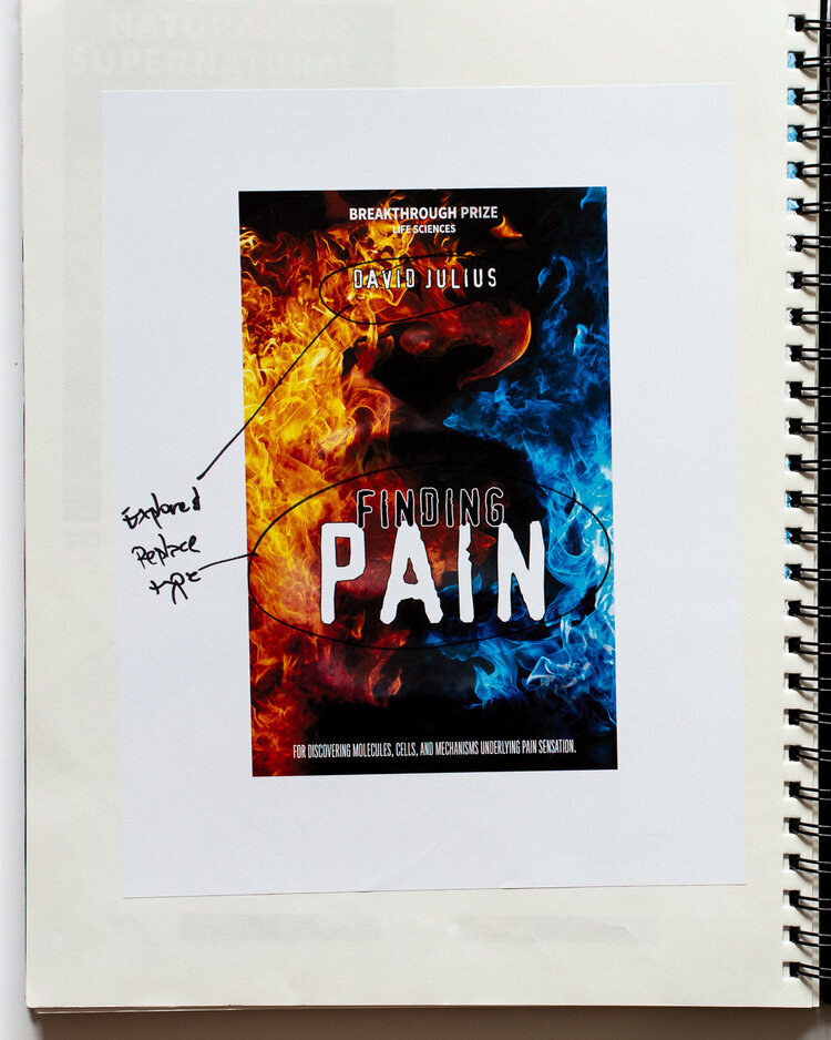
David Julius of the University of San Francisco discovered cellular signaling mechanisms that produce pain sensation. Among other curiosities, he found that chili peppers and menthol trigger the same sensory receptors in the nervous system that ordinarily respond to heat and cold. For this poster, I wanted to tell the story as if it were an action thriller, with a touch of horror—after all, pain is scary. After exploring images of chilies and ice, I settled on a red and blue flame motif, into which is layered a subtle shadow of a face grimacing in pain—although I may be the only person who knows it is there. After exploring distressed or expressive typography, I ultimately settled on a sharp geometric face quietly placed in the center of the image, creating tension without being ostentatious. A last-minute copy change to the title sealed the deal.


The Chaperone
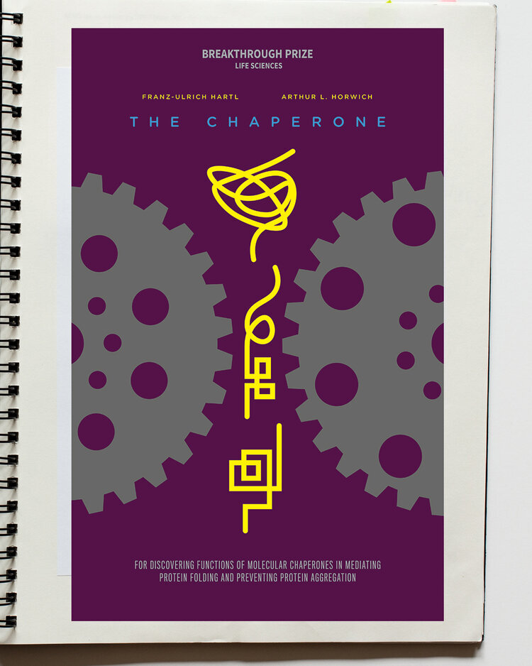
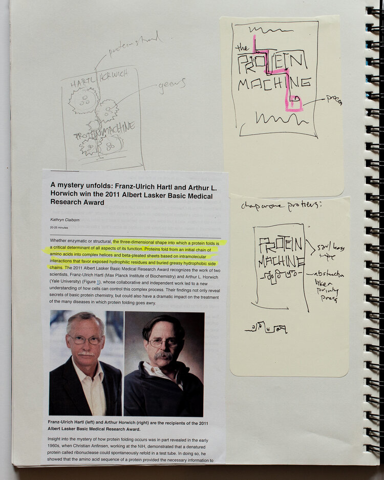
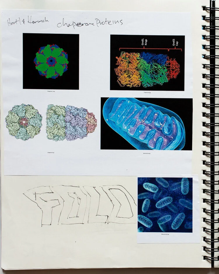
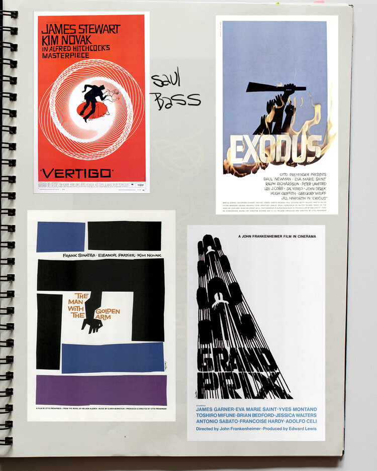
This was the most difficult poster in the project to solve graphically. Discovered by Ulrich Hartl and Art Horwich, the “chaperone” protein is a cellular machinery that helps proteins fold into the shapes they need to perform their tasks—which is apparently how proteins function! The chaperone machinery looks like little cellular barrels, with lids that open and close as proteins enter and exit. Hartl and Horwich theorize that as we age, the body’s ability to fold proteins into shapes that work properly may recede, resulting in degenerative diseases like Alzheimer’s and Parkinson’s.
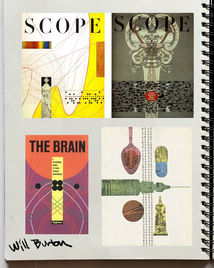
To tell the story, I wanted to show the process graphically, without using cellular images, which could distract from explaining the concept. In studying classic movie posters, I first looked to Saul Bass, the modernist master of the film title, and his poster for “The Man With the Golden Arm.” However, this homage was just too much of a riff for my taste. Doing further research, I discovered the work of Will Burtin, a German émigré who was an early Art Director of Fortune Magazine. Burtin was a master of designing information graphics, especially around science. His work for the Upjohn company is quite extraordinary in explaining complex scientific ideas to a general audience. I imagined how Burtin might approach this problem. My minimalist solution to the problem paired images of mechanical gears representing machinery with a line that, in a three-step sequence goes from a squiggly mess to a neatly folded instrument, ready to do the cellular job for which it is intended.
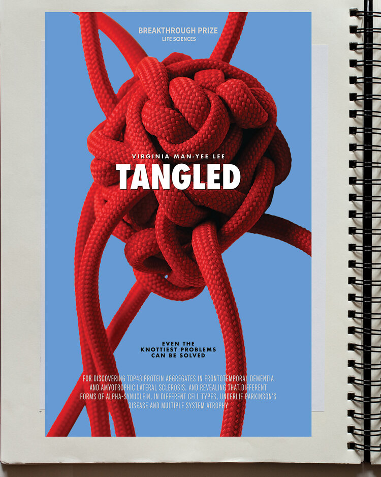

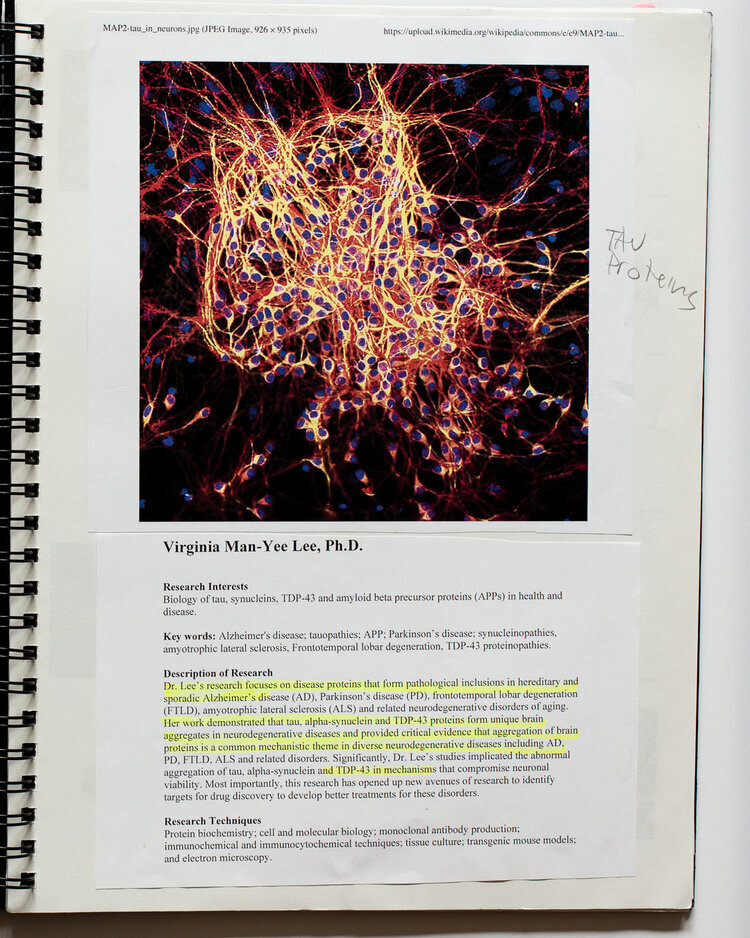

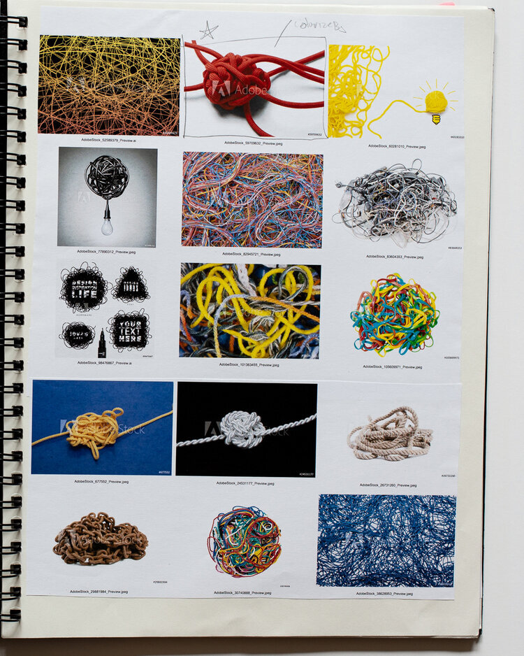


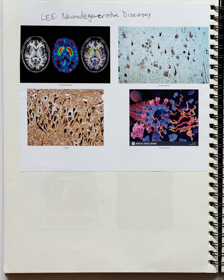
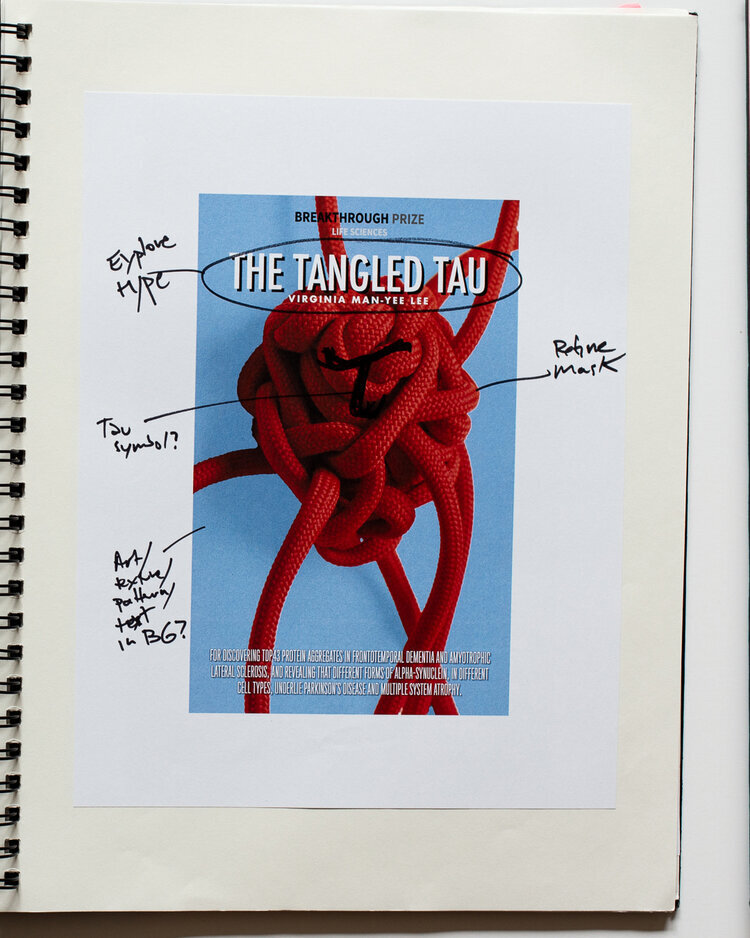
Tangled
Virgina Lee has found proteins in the brain that become tangled over time, which may explain how Alzheimer’s, Parkinson’s, ALS, and other neurodegenerative diseases develop. To tell this story, I wanted to show an allegorical tangle with an organic shape, but not go into imagery of brain scans themselves. The image I landed on was of a red rope, knotted into a lumpy tangle, with several strands protruding. After some copy variations with the name, we decided that the story was best told simply titled “Tangled.”
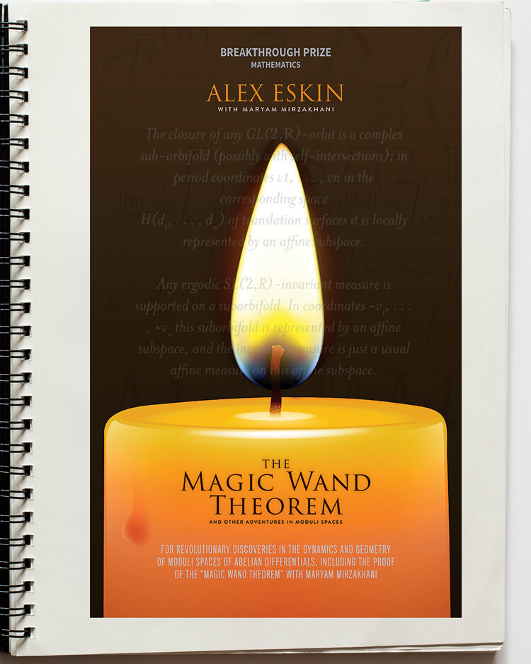


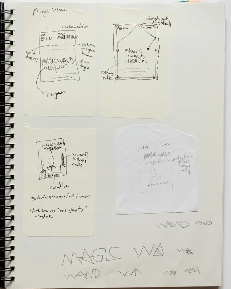
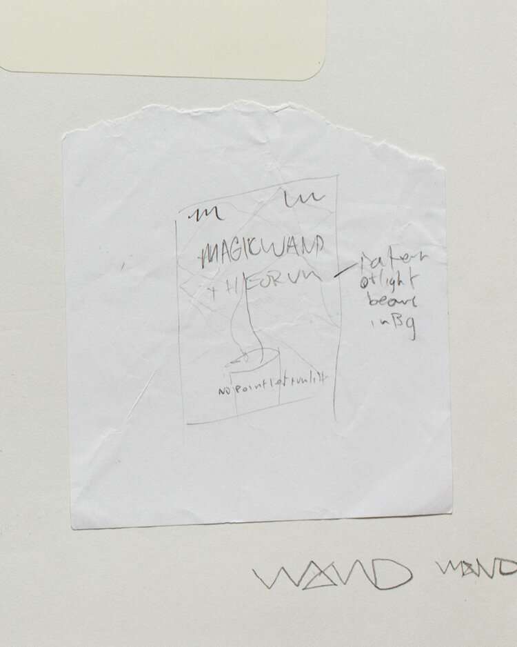
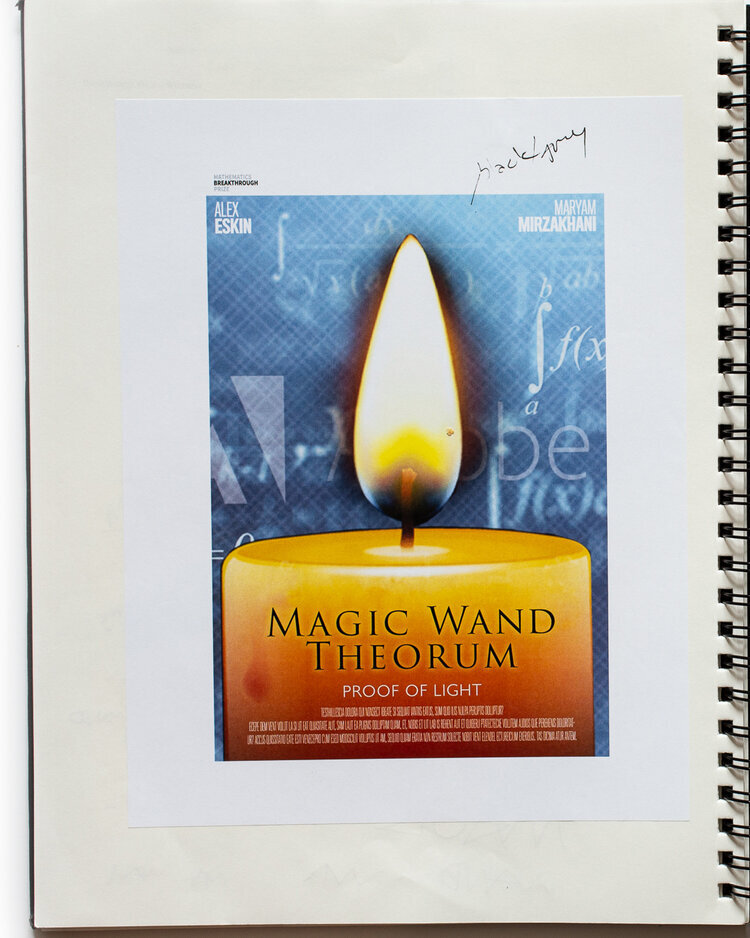
Magic Wand Theorem
This revolutionary mathematical discovery takes its name from the idea that it might be applied to solve many other advanced math problems, like a magic wand. Proven by Alex Eskin of the University of Chicago, working with the late Iranian-American mathematician Maryam Mirzakhani, it addresses a long standing problem: If a beam of light from a point source bounces around a mirrored room, will it eventually illuminate the entire room?
To tell this story, I cast a candle in the poster to represent the single point of light. The theorem itself is overlaid as a textural element. A dark and muted color palette conveys a sense of mystery. Finally, the title is set in Trajan, seemingly the official typeface of Hollywood dramas.
Bibliography
While working on this project, I did a deep dive into the history and aesthetics of film posters. As I am often inclined to do, my first step was to pay a visit to New York bookstores including The Strand and McNally Jackson Books, and drop a few dollars on books (ok, it was a couple hundred—some people spend money on shoes…I buy books…). I also utilized the library at the Pratt Institute, where I made a discovery that changed the course of one poster in particular.
As I worked through these books, I used a color coded system of Post-It page flags to denote which poster a particular reference might be relevant to.
These are the books that had a major impact on this project:

The Art of the Modern Movie Poster
Judith Salavetz, Spencer Drate, Sam Sarowitz, Dave Wehr (Chronicle Books, 2008)
At 516 pages, and 8 lbs., this tome is an authoritative survey of twentieth century movie posters, organized by country. While all of the classics are here, some of the most surprising and delightful entries are from Eastern European countries, including Poland, Czechoslovakia, and Hungary. There are also profiles of prominent poster designers, and comparison of posters advertising the same film, but from different countries.

Typeset in the Future
Dave Addey, with a forward by Matt Zoller Seitz (Abrams, 2018)
An obsessive analysis of the typography used in science fiction films, based on a blog by the same name. The level of detail that Addey goes into when examining typography in movies including 2001: A Space Odyssey, Star Trek, Blade Runner, and even Wall-E is both impressive, and kind of scary… The bottom line: If you want a film logotype to scream “science fiction,” set it in Eurostile Bold Extended.
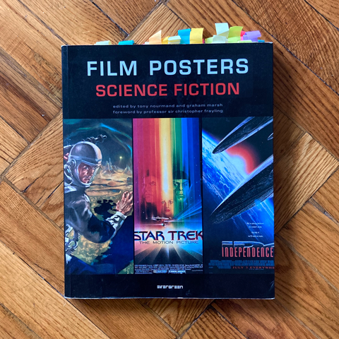
Film Posters: Science Fiction
Edited by Tony Nourmand and Graham Marsh (Evergreen/Taschen, 2006)
A comprehensive survey of science fiction movie posters from around the world. Short texts giving context and background accompany many posters, and there are several good comparisons of posters for the same movie, designed in different countries. The one knock on this book is a layout and sequence which doesn’t seem to follow a strict logic.
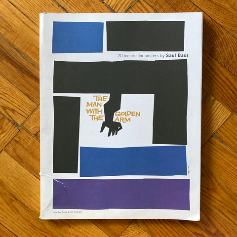
Saul Bass: 20 Iconic Film Posters
Jennifer Bass and Pat Kirkham (Laurence King, 2016)
This oversize collection of reproductions of Saul Bass’s most iconic film posters is a short, but incredible, collection. Each of the featured posters comes with a short write up to it’s story and context, and can be torn out and displayed as a poster. But I’ll keep it intact—for now. I initially researched Bass and his work as a potential direction for “The Chaperone,” but ultimately went in a different direction. Still, I got an excuse to purchase this book!

Universe: Exploring the Astronomical World
(Phaidon, 2017)
A survey of visual representation of the cosmos throughout time, this book contains everything from cave drawings, to art, to images from the Hubble telescope. This is a beautiful book, and the rare art book I can share with my four-year-old. An invaluable reference for this project, as we grappled with how to represent the concept “seeing the invisible”

Design and Science: The Life and Work of Will Burtin
R. Roger Remington and Robert S. P. Fripp (Lund Humphries, 2007)
This book exemplifies why I love spending time in libraries and bookstores. As a Assistant Visiting Professor at the Pratt Institute, I would spend (pre-Covid) many weekend afternoons in the stacks, perusing books on art, design, architecture, and photography. Discovering this book, and the work of Will Burtin, was a happy accident. As described above, I had been struggling with the poster for “The Chaperone.” Initially, I leaned into an homage to Saul Bass, but it didn’t feel right to just rip off a legend (the graffiti writer in me loathes “biting”). I wanted to find a way in through studying Bass’s approach and process.
While searching the stacks in the Pratt Library for a monograph on Bass, I glanced down, and by chance noticed the spine of this book, which stated exactly what I needed—Design and Science! Not previously familiar with Burtin’s work, I quickly checked this book out, and dove in. Burtin, who fled Nazi Germany after being suggested as the reich’s art director, made significant contributions to infographic, editorial, and installation design in the United States from the 1940s through 1970s. His work for Fortune magazine and Upjohn Pharmaceuticals is quite amazing in it’s beauty and clarity—he was able to distill very complex scientific information down to a form digestible for a public audience. Burtin was exactly the historical mentor I needed to find a solution to the graphic problem I was faced with.